Designing how scientists review AI analysis
- My role
- Product Designer & CPOSole designer in a team of five, responsible for product design and product direction.
- Period
- Aug 2023 → presentzero to live experiments in nine months, across three product generations
- Scope
- Research · product model · UX/UI · design system · ownership~40 screens over 3 user roles, on a web platform and on the instrument itself
- Field
- Drug discovery and developmental toxicologybuilt on research published in Nature Methods and featured in Method of the Year 2023
- 8 hours~30 min
- Scientist's hands-on time per run
- 3–7%
- Results flagged for detailed review
- Zero9 months
- To the first live experiments
- ~40 screens
- Across 3 roles and 2 surfaces, on ~40 components
Workflow figures are based on internal measurement and are approximate. Every run requires a scientist’s sign-off.
Interfaces are reconstructed in English with synthetic experiment data.
In one paragraph
Turning a research method into a usable product
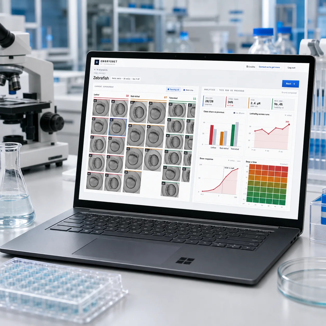
EmbryoNet uses AI to analyse images of developing embryos and identify how compounds affect them.
The platform is based on research from the University of Konstanz published in Nature Methods.
I joined as the sole designer and CPO in a team of five. I designed the web platform and the interface for EmbryoScan, the portable microscope developed by the team. My work covered research, experiment setup, result review, correction and the design system.
The main challenge was helping scientists inspect and verify the model’s output within their existing workflow. Results needed supporting evidence, a record of changes and human sign-off. The first live experiments ran through the product nine months after we started.
The argument in three screens
A design that failed, what replaced it, and what a scientist does when the model is wrong. Each is shown in full further down; these link to where.
The research
What research changed
I conducted around 40 interviews with principal investigators, postdocs and lab technicians across three product generations.
Four findings shaped the design:
- Scientists needed to inspect the evidence behind a result.
- They organised experiments by well position, so the interface needed to preserve the plate layout.
- Tables were more useful for reviewing a whole experiment; images mattered when examining individual results.
- Labs wanted the product to fit their existing data systems rather than replace them.
Setting up a run
Setting up an experiment
Labs already used spreadsheets to record compounds, concentrations and controls by well position.
I kept that spatial model in the interface: scientists could select a range of wells and assign values directly on the plate grid.
Setup was available on both the web and the instrument, so the person preparing the plate could record its contents where they worked.
Triage, or designing for the part where the model is wrong
A queue instead of a spreadsheet
My first design displayed a confidence score beside each result.
In testing, scientists compared those scores as though they were experimental measurements. The interface was making model confidence look like scientific data.
I changed the design so confidence routed results into a review queue instead.
Around 3–7% of results were flagged for detailed inspection, with footage available alongside them. Scientists could still inspect any result, and the full run required human sign-off.
Review controls
- Every run requires a scientist's sign-off.
- Labs can adjust the review threshold for their work.
- Source images remain accessible from every result.
Correcting a frame, and sending the run back
Correcting a result
Scientists could mark the frame where a classification became incorrect, correct it and rerun the analysis from that point.
The interface showed which subsequent frames would be recalculated.
Sharing data for model training was a separate choice. Labs had to opt in before their de-identified experiment data and corrections could be used for that purpose.
What we decided not to build
Choosing what not to build
The original plan included storage and reporting alongside imaging and analysis.
Interviews showed that labs already had systems for that work. I argued for a narrower scope: keep imaging, analysis, review and correction, and export results for use in the lab’s existing systems.
This let our five-person team focus on the workflow the product was built to improve.
Three roles, two surfaces
One run, three views of it
I designed separate views for running an experiment, comparing results across experiments, and administering access and sign-off.
The instrument interface focused on experiment setup, run status and calibration. Detailed review and comparison stayed on the web platform.
The design systemForty components
I built a shared system of around 40 components, including plate grids and time-series views, to support the web and instrument interfaces.
Results
Outcomes and my contribution
The product reduced scientists' hands-on time per run from around eight hours to thirty minutes.
This was a combined result of the analysis technology and the workflow around it. My contribution was designing setup, targeted review, evidence inspection and correction.
We reached the first live experiments in nine months. Across three product generations, I designed around 40 screens covering three user roles and both the web platform and instrument interface.
What I would do differently
What I would improve
Three things I would change on a similar product.
- Support multiple models and result types earlier in the product structure.
- Design partial and interrupted runs as normal workflows from the start.
- Test basic navigation, feedback and empty states as carefully as the specialist tools.
Open to Senior Product Designer roles
Based in Porto, Portugal, with authorisation to work here. Get in touch about a Senior Product Designer role or to discuss my work in more detail.